Taxonomic Analysis with R
Overview
Teaching: 40 min
Exercises: 20 minQuestions
How can we know which taxa are in our samples?
How can we compare depth-contrasting samples?
How can we manipulate our data to deliver a message?
Objectives
Manipulate data types inside your phyloseq object.
Extract specific information from taxonomic-assignation data.
Explore our samples at specific taxonomic levels
With the taxonomic assignment information that we obtained from Kraken, we have measured diversity, and we have visualized the taxa inside each sample with Krona and Pavian, but Phyloseq allows us to make this visualization more flexible and personalized. So now, we will use Phyloseq to make abundance plots of the taxa in our samples.
We will start our exploration at the Phylum level. In order to group all the OTUs that have the same taxonomy at a certain taxonomic rank,
we will use the function tax_glom().
> percentages_glom <- tax_glom(percentages, taxrank = 'Phylum')
> View(percentages_glom@tax_table@.Data)
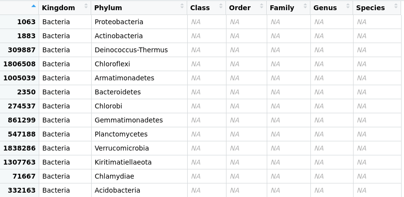 Figure 1. Taxonomic-data table after agglomeration at the phylum level.
Another phyloseq function is psmelt(), which melts phyloseq objects into a data.frame
to manipulate them with packages like ggplot2 and vegan.
> percentages_df <- psmelt(percentages_glom)
> str(percentages_df)
'data.frame': 99 obs. of  5 variables:
 $ OTU      : chr  "1063" "1063" "1063" "2350" ...
 $ Sample   : chr  "JP4D" "JC1A" "JP41" "JP41" ...
 $ Abundance: num  85 73.5 58.7 23.8 19.1 ...
 $ Kingdom  : chr  "Bacteria" "Bacteria" "Bacteria" "Bacteria" ...
 $ Phylum   : chr  "Proteobacteria" "Proteobacteria" "Proteobacteria" "Bacteroidetes" ...
Now, let’s create another data frame with the original data. This structure will help us to compare the absolute with the relative abundance and have a complete picture of our samples.
> absolute_glom <- tax_glom(physeq = merged_metagenomes, taxrank = "Phylum")
> absolute_df <- psmelt(absolute_glom)
> str(absolute_df)
'data.frame': 99 obs. of  5 variables:
 $ OTU      : chr  "1063" "1063" "2350" "1063" ...
 $ Sample   : chr  "JP4D" "JP41" "JP41" "JC1A" ...
 $ Abundance: num  116538 41798 16964 12524 9227 ...
 $ Kingdom  : chr  "Bacteria" "Bacteria" "Bacteria" "Bacteria" ...
 $ Phylum   : chr  "Proteobacteria" "Proteobacteria" "Bacteroidetes" "Proteobacteria" ...
With these objects and what we have learned regarding R data structures and ggplot2, we can compare them
with a plot. First, let’s take some steps that will allow us to personalize our plot, making it accessible for color blindness.
We will create a color palette. With colorRampPalette, we will choose eight colors from the Dark2 palette and make a “ramp” with it; that is, convert those eight colors to the number of colors needed to have one for each phylum in our data frame. We need to have our Phylum column in the factor structure for this.
> absolute_df$Phylum <- as.factor(absolute_df$Phylum)
> phylum_colors_abs<- colorRampPalette(brewer.pal(8,"Dark2")) (length(levels(absolute_df$Phylum)))
Now, let´s create the figure for the data with absolute abundances (, i.e., absolute_plot object)
> absolute_plot <- ggplot(data= absolute_df, aes(x=Sample, y=Abundance, fill=Phylum))+
    geom_bar(aes(), stat="identity", position="stack")+
    scale_fill_manual(values = phylum_colors_abs)
With the position="stack" command, we are telling the ggplot function that the values must stack each other for each sample. In this way, we will
have all of our different categories (OTUs) stacked in one bar and not each in a separate one.
For more info position_stack
Next, we will create the figure for the representation of the relative abundance data and ask RStudio to show us both plots thanks to the | function from the library patchwork:
> percentages_df$Phylum <- as.factor(percentages_df$Phylum)
> phylum_colors_rel<- colorRampPalette(brewer.pal(8,"Dark2")) (length(levels(percentages_df$Phylum)))
> relative_plot <- ggplot(data=percentages_df, aes(x=Sample, y=Abundance, fill=Phylum))+
    geom_bar(aes(), stat="identity", position="stack")+
    scale_fill_manual(values = phylum_colors_rel)
> absolute_plot | relative_plot
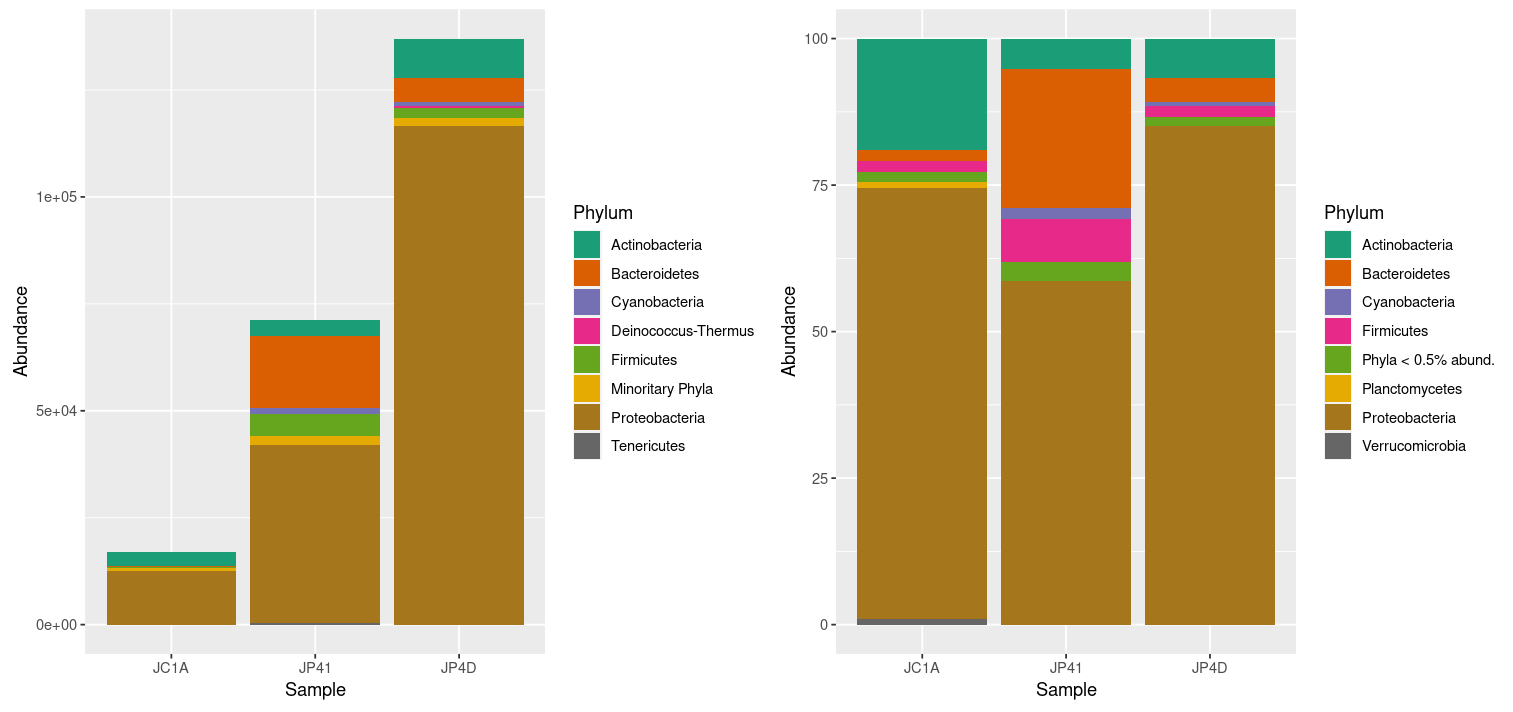
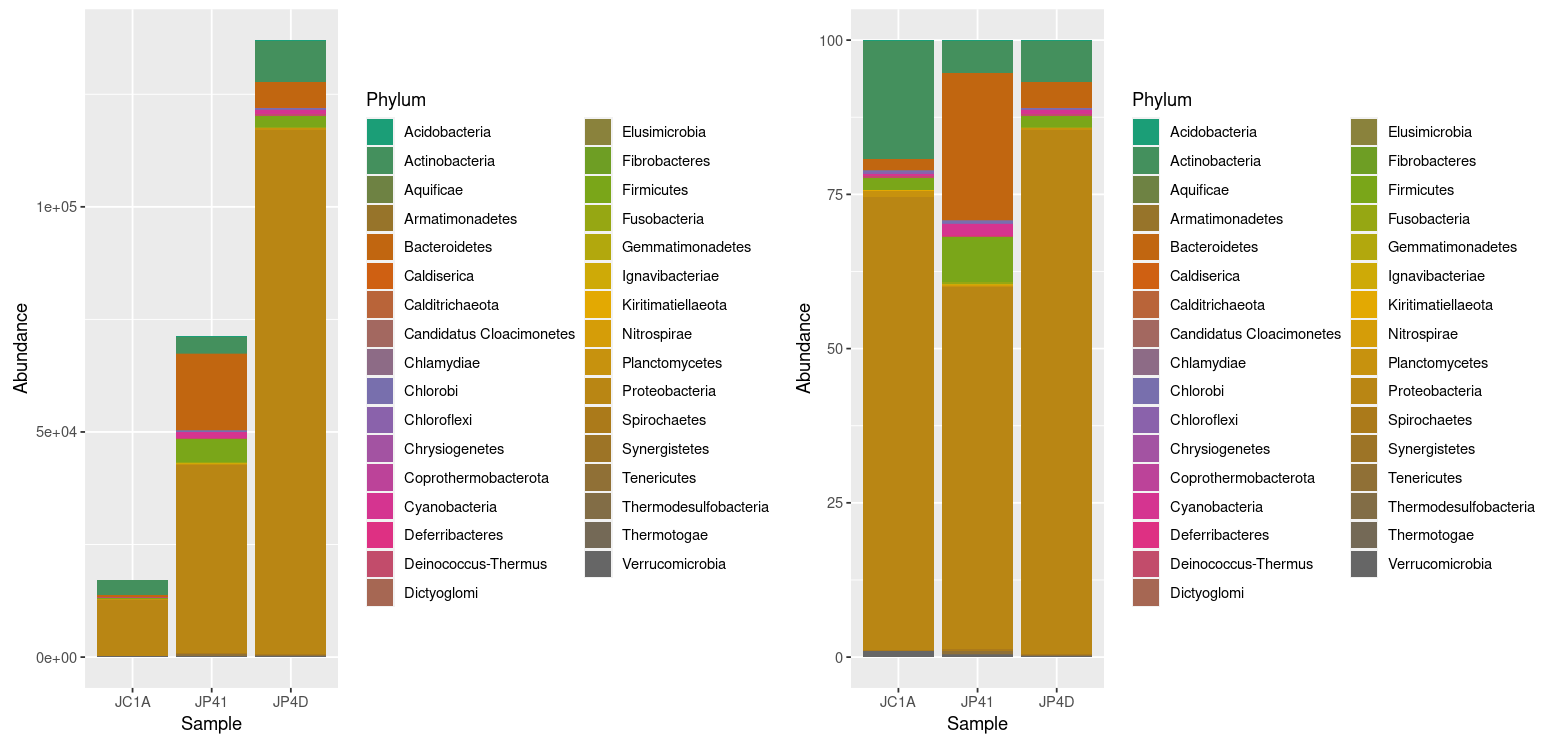 Figure 2. Taxonomic diversity of absolute and relative abundance.
At once, we can denote the difference between the two plots and how processing the data can enhance the display of actual results. However, it is noticeable that we have too many taxa to adequately distinguish the color of each one, less of the ones that hold the most incredible abundance. In order to change that, we will use the power of data frames and R. We will change the identification of the OTUs whose relative abundance is less than 0.2%:
> percentages_df$Phylum <- as.character(percentages_df$Phylum) # Return the Phylum column to be of type character
> percentages_df$Phylum[percentages_df$Abundance < 0.5] <- "Phyla < 0.5% abund."
> unique(percentages_df$Phylum)
[1] "Proteobacteria"    "Bacteroidetes"     "Actinobacteria"    "Firmicutes"        "Cyanobacteria"
[6] "Planctomycetes"    "Verrucomicrobia"   "Phyla < 0.5 abund"
Let’s ask R to display the figures again by re-running our code:
> percentages_df$Phylum <- as.factor(percentages_df$Phylum)
> phylum_colors_rel<- colorRampPalette(brewer.pal(8,"Dark2")) (length(levels(percentages_df$Phylum)))
> relative_plot <- ggplot(data=percentages_df, aes(x=Sample, y=Abundance, fill=Phylum))+
  geom_bar(aes(), stat="identity", position="stack")+
  scale_fill_manual(values = phylum_colors_rel)
> absolute_plot | relative_plot
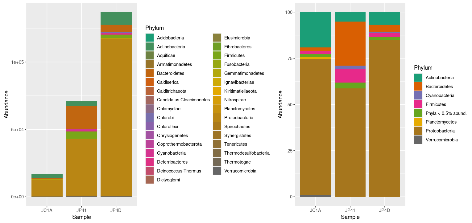 Figure 3. Taxonomic diversity of absolute and relative abundance with corrections.
Going further, let’s take an exciting lineage and explore it thoroughly
As we have already reviewed, Phyloseq offers many tools to manage and explore data. Let’s take a
look at a function we already use but now with guided exploration. The subset_taxa command is used to extract specific lineages from a stated taxonomic level; we have used it to get
rid of the reads that do not belong to bacteria with merged_metagenomes <- subset_taxa(merged_metagenomes, Kingdom == "Bacteria").
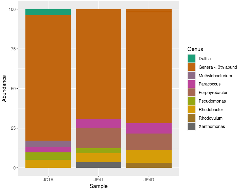
We will use it now to extract a specific phylum from our data and explore it at a lower taxonomic level: Genus. We will take as an example the phylum Cyanobacteria (indeed, this is a biased and arbitrary decision, but who does not feel attracted to these incredible microorganisms?):
> cyanos <- subset_taxa(merged_metagenomes, Phylum == "Cyanobacteria")
> unique(cyanos@tax_table@.Data[,2])
[1] "Cyanobacteria"
Let’s do a little review of all that we saw today: Transformation of the data; Manipulation of the information; and plotting:
> cyanos_percentages <- transform_sample_counts(cyanos, function(x) x*100 / sum(x) )
> cyanos_glom <- tax_glom(cyanos_percentages, taxrank = "Genus")
> cyanos_df <- psmelt(cyanos_glom)
> cyanos_df$Genus[cyanos_df$Abundance < 10] <- "Genera < 10.0 abund"
> cyanos_df$Genus <- as.factor(cyanos_df$Genus)
> genus_colors_cyanos<- colorRampPalette(brewer.pal(8,"Dark2")) (length(levels(cyanos_df$Genus)))
> plot_cyanos <- ggplot(data=cyanos_df, aes(x=Sample, y=Abundance, fill=Genus))+
    geom_bar(aes(), stat="identity", position="stack")+
    scale_fill_manual(values = genus_colors_cyanos)
> plot_cyanos
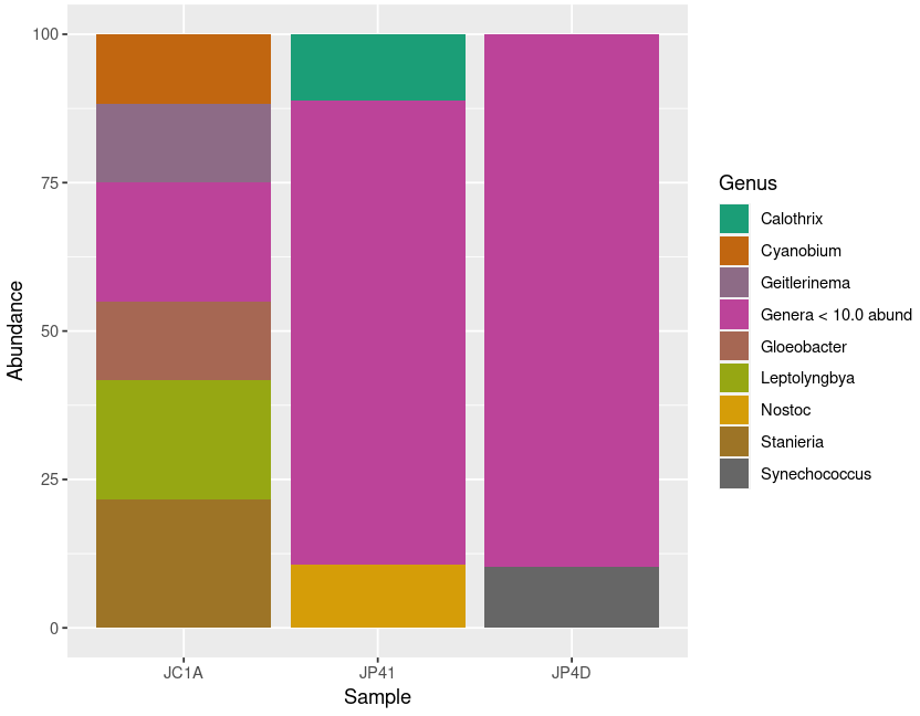 Figure 5. Diversity of Cyanobacteria at genus level inside our samples.
Exercise 1: Taxa agglomeration
With the following code, in the dataset with absolute abundances,
group together the phyla with a small number of reads to have a better visualization of the data. Remember to check the data classes inside your data frame.
According to the ColorBrewer package it is recommended not to have more than nine different colors in a plot.What is the correct order to run the following chunks of code? Compare your graphs with your partners’.
Hic Sunt Leones! (Here be Lions!):
A)
absolute_df$Phylum <- as.factor(absolute_df$Phylum)B)
absolute_plot <- ggplot(data= absolute_df, aes(x=Sample, y=Abundance, fill=Phylum))+
geom_bar(aes(), stat="identity", position="stack")+
scale_fill_manual(values = phylum_colors_abs)C)
absolute_$Phylum[absolute_$Abundance < 300] <- "Minoritary Phyla"D)
phylum_colors_abs<- colorRampPalette(brewer.pal(8,"Dark2")) (length(levels(absolute_df$Phylum)))E)
absolute_df$Phylum <- as.character(absolute_df$Phylum)Solution
By grouping the samples with less than 300 reads, we can get a more decent plot. Certainly, this will be difficult since each sample has a contrasting number of reads.
E)
absolute_df$Phylum <- as.character(absolute_df$Phylum)C)
absolute_df$Phylum[absolute_$Abundance < 300] <- "Minoritary Phyla"A)
absolute_df$Phylum <- as.factor(absolute_df$Phylum)D)
phylum_colors_abs<- colorRampPalette(brewer.pal(8,"Dark2")) (length(levels(absolute_df$Phylum)))B)
absolute_plot <- ggplot(data= absolute_df, aes(x=Sample, y=Abundance, fill=Phylum))+
geom_bar(aes(), stat="identity", position="stack")+
scale_fill_manual(values = phylum_colors_abs)Show your plots:
absolute_plot | relative_plot
Exercise 2: Recap of abundance plotting
Match the chunk of code with its description and put them in the correct order to create a relative abundance plot at the genus level of a particular phylum. がんばって! (ganbatte; good luck):
Description Command plot the relative abundance at the genus levels. plot_proteoConvert all the genera with less than 3% abundance into only one label. proteo_percentages <- transform_sample_counts(proteo, function(x) >x*100 / sum(x) )Make just one row that groups all the observations of the same genus. proteo <- subset_taxa(merged_metagenomes, Phylum == "Proteobacteria")Create a phyloseq object only with the reads assigned to a certain phylum. unique(proteo@tax_table@.Data[,2])Show the plot. proteo_glom <- tax_glom(proteo_percentages, taxrank = "Genus")Transform the phyloseq object to a data frame. plot_proteo <- ggplot(data=proteo_df, aes(x=Sample, y=Abundance, fill=Genus))+geom_bar(aes(), stat="identity", position="stack")+scale_fill_manual(values = genus_colors_proteo)Convert the Genus column into the factor structure. proteo_df$Genus[proteo_df$Abundance < 3] <- "Genera < 3% abund"Look at the phyla present in your phyloseq object. proteo_df <- psmelt(proteo_glom)Convert the abundance counts to relative abundance. genus_colors_proteo<- colorRampPalette(brewer.pal(8,"Dark2")) (length(levels(proteo_df$Genus)))Make a palette with the appropriate colors for the number of genera. proteo_df$Genus <- as.factor(proteo_df$Genus)Solution
# Create a phyloseq object only with the reads assigned to a certain phylum.
proteo <- subset_taxa(merged_metagenomes, Phylum == "Proteobacteria")
# Look at the phyla present in your phyloseq object
unique(proteo@tax_table@.Data[,2])
# Convert the abundance counts to the relative abundance
proteo_percentages <- transform_sample_counts(proteo, function(x) x*100 / sum(x) )
# Make just one row that groups all the observations of the same genus.
proteo_glom <- tax_glom(proteo_percentages, taxrank = "Genus")
# Transform the phyloseq object to a data frame
proteo_df <- psmelt(proteo_glom)
# Convert all the genera that have less than 3% of abundance into only one label
proteo_df$Genus[proteo_df$Abundance < 3] <- "Genera < 3% abund"
# Convert the Genus column into the factor structure
proteo_df$Genus <- as.factor(proteo_df$Genus)
# Make a palette with the appropriate colors for the number of genera
genus_colors_proteo<- colorRampPalette(brewer.pal(8,"Dark2")) (length(levels(proteo_df$Genus)))
# Plot the relative abundance at the genus levels
plot_proteo <- ggplot(data=proteo_df, aes(x=Sample, y=Abundance, fill=Genus))+
  geom_bar(aes(), stat="identity", position="stack")+
  scale_fill_manual(values = genus_colors_proteo)
# Show the plot
plot_proteo
Key Points
Depths and abundances can be visualized using phyloseq.
The library
phyloseqlets you manipulate metagenomic data in a taxonomic specific perspective.