Making Graphs with ggplot2
Overview
Teaching: 15 min
Exercises: 10 minQuestions
How can I create useful graphs in R?
Objectives
Create figures using ggplot2.
Install and use libraries in R.
R Libraries
Until now, we have used the basal functions included in the R language. But, R can use groups of functions for diverse purposes. These are called packages or libraries. A package is a family of code units (functions, classes, variables) that implement a set of related tasks. Installing a package is like buying a new piece of lab equipment. Loading a package is like getting that piece of lab equipment out of a storage locker and setting it up in the working space. Packages provide additional functionality to the basic R code, much like a new piece of equipment adds functionality to a lab space. R has its own base plotting system, but we will use a package that will help us to create more artistic figures:ggplot2.
Let’s install the ggplot2 library.
> install.packages("ggplot2")
Now that it is installed we have to load it. It is a good practice to load all the libraries that you will use in a script at the beginning of that script.
library(ggplot2)
Visualizing data with ggplot2
ggplot2 has been created with the idea that any graph can be expressed with three components:
- Data set
- Coordinates
- Set of geoms, that is the visual representation of the data
These geoms can be thought of as layers that can be overlapped one over another, so special care is required to show useful information layers to deliver a message. We are going to create an example with some of the data that we already have.
> musician
    people pieces likes
1  Medtner    722 FALSE
2 Radwimps    187  TRUE
3  Shakira     68  TRUE
First, let’s try to make a figure only with the data and coordinates components, to see what we are talking about.
> ggplot(data= musician,
       mapping = aes(x = people, y = pieces))
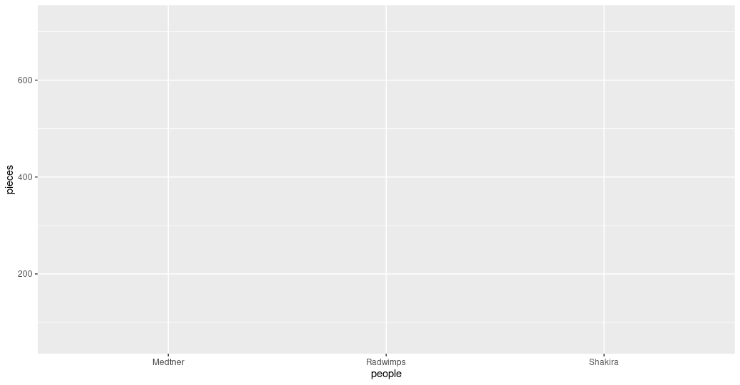 Figure 1. A graph without data representation.
Unraveling the above code. We first called the ggplot function (i.e. ggplot()). This will tell R that we want to
create a new plot, and the parameters indicated inside this function will apply to all the layers of the plot. We
gave two arguments to the ggplot code: (i) the data that we want to show in our figure (i.e. data = musician),
and (ii) the way of displaying it in the graph (i.e. mapping = aes(x = people,y = pieces)),
which will tell ggplot how the variables will be mapped in the figure. In this case, x is the name of the
musicians, and y is the number of pieces each of them composed. It is noticeable that we did not need to express the entire path to access
these columns to the aes function (i.e. x = musician[,”people”]). That is because the code is so well
written that figures it out by itself. With this, we have made the base of our plot, but we can’t see the data
because we have not chosen a graphic way of representing it (i.e. the geoms).
> ggplot(data= musician,
        mapping = aes(x = people, y = pieces))+
  geom_col()
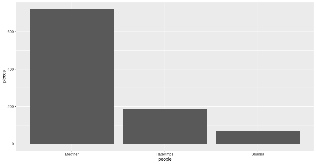 Figure 2. Bar plot of the pieces composed by each musician.
Some elements of the graphs can be informative or merely decorative. If we want it to be informative, it needs to go
inside the aes() function and say what information it will display. If we want it to be decorative it must be outside of aes().
Let’s see how this work with the color.
> ggplot(data= musician,
       mapping = aes(x = people, y = pieces))+
  geom_col(color = "blue")
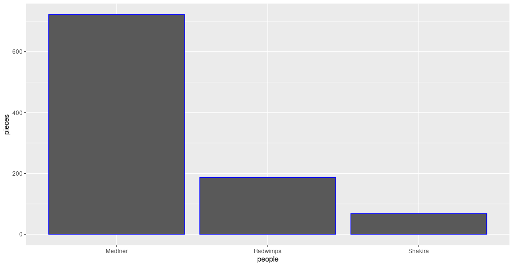 Figure 3. Bar plot with the decorative color parameter.
ggplot(data= musician,
       mapping = aes(x = people, y = pieces))+
  geom_col(aes(color= likes))
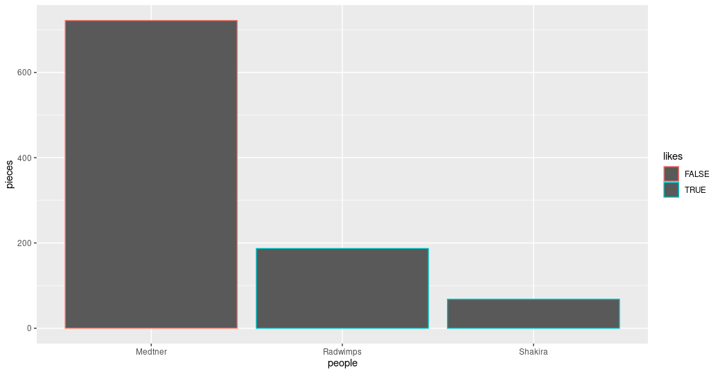 Figure 4. Bar plot with the informative color parameter.
Exercise 1: Global and specific parameters.
Search for more available geoms and chose one that is appropriate to display the same information as the bars. Add it to your graph using the
+sign after the last geom. Explore what happens if the color parameters are in theggplot()part of the command or in each of the geoms.Solution
ggplot(data= musician,
      mapping = aes(x = people, y = pieces))+
 geom_col(aes(color= likes))+
 geom_point()
Figure 5. Bar and point plot.
ggplot(data= musician,
      mapping = aes(x = people, y = pieces, color= likes))+
 geom_col()+
 geom_point()
Figure 6. Bar and point plot with global color.
Advanced exercise: Personalize informative colors.
Search how to personalize which colors are used when the color is an informative parameter.
Solution
ggplot(data= musician,
      mapping = aes(x = people, y = pieces, color= likes))+
 scale_color_manual(values= c("blue", "orange"))+
 geom_col()+
 geom_point()
Figure 7. Bar and point plot with personalized colors.
Key Points
The library
ggplot2creates plots that help/remarks the data analysis.Creativity is welcome to explore and present your data.
Libraries in R allow us to have sets of functions specialized in a global purpose.